Pillar Panels
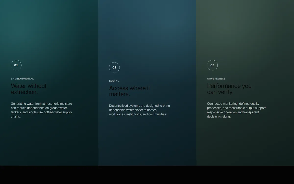
Three full-height panels side by side, each on its own gradient ground with a dashed numbered marker, a category and a short statement. Takes an optional looping video per panel.
- Features
- No dependencies
- MIT
- Google Sans Flex · SIL Open Font License 1.1
 Loading
Copy the code
The whole component, in one file. Yours from the moment you paste it.
Install it
Straight into a project with a shadcn setup — no account, no limit.
npx shadcn@latest add https://designblocs.com/r/pillar-panels.jsonHand it to an agent
A prompt for Claude Code, Cursor or v0 that adapts the component to your codebase rather than pasting it in raw.
src/components/ui-library/blocks/PillarPanels.tsx
/**
 * PillarPanels — three full-height panels, each its own ground, read left to right.
 *
 * A numbered marker, a category, a short title and a sentence, on a gradient
 * built for that panel. Each panel can take a looping background video; without
 * one the gradient is the design rather than a placeholder, which is why the
 * component ships no media of its own — supply a `video` when you have one.
 *
 * At desk widths the three sit side by side, divided by hairlines, and the row
 * is tall enough to be a chapter rather than a strip. Below 1024px they stack,
 * and the divider moves from the left edge to the top.
 *
 * The heading exists for the document outline but is visually hidden: the
 * panels are the heading, and a second one above them would be noise.
 *
 * SELF-CONTAINED: imports React and nothing else.
 */

export interface Pillar {
  /** The figure in the dashed marker — "01". */
  number: string;
  category: string;
  title: string;
  description: string;
  /** One of the built-in grounds, or leave it and set `gradient`. */
  tone?: "environment" | "social" | "governance";
  /** A full CSS background value, when the built-in grounds don't suit. */
  gradient?: string;
  /** Optional looping video behind the panel. Muted and decorative. */
  video?: string;
}

export interface PillarPanelsProps {
  /** Names the section for assistive technology and the document outline. */
  heading?: string;
  pillars?: Pillar[];
}

const DEFAULTS = {
  heading: "ESG in practice",
  pillars: [
    {
      number: "01",
      category: "Environmental",
      title: "Water without extraction.",
      description:
        "Generating water from atmospheric moisture can reduce dependence on groundwater, tankers, and single-use bottled-water supply chains.",
      tone: "environment" as const,
    },
    {
      number: "02",
      category: "Social",
      title: "Access where it matters.",
      description:
        "Decentralised systems are designed to bring dependable water closer to homes, workplaces, institutions, and communities.",
      tone: "social" as const,
    },
    {
      number: "03",
      category: "Governance",
      title: "Performance you can verify.",
      description:
        "Connected monitoring, defined quality processes, and measurable output support responsible operation and transparent decision-making.",
      tone: "governance" as const,
    },
  ] as Pillar[],
};

const STYLES = `
[data-block="PillarPanels"],
[data-block="PillarPanels"] :is(h2, h3, p, div) {
  font-family: "Google Sans Flex", "Inter Variable", Inter, ui-sans-serif, system-ui, -apple-system, sans-serif;
}
[data-block="PillarPanels"] {
  position: relative;
  display: grid;
  grid-template-columns: repeat(3, minmax(0, 1fr));
  min-height: 90svh;
  overflow: hidden;
  isolation: isolate;
  color: #fff;
  background: #10292b;
}

/* Named so the document has an outline; the panels are what is read. */
[data-block="PillarPanels"] .pp-sr {
  position: absolute;
  width: 1px;
  height: 1px;
  padding: 0;
  margin: -1px;
  overflow: hidden;
  clip: rect(0, 0, 0, 0);
  white-space: nowrap;
  border: 0;
}

[data-block="PillarPanels"] .pp-panel {
  position: relative;
  display: flex;
  align-items: center;
  min-width: 0;
  min-height: 90svh;
  padding: clamp(110px, 15vh, 160px) clamp(30px, 3.7vw, 72px) 72px;
  overflow: hidden;
  isolation: isolate;
}
[data-block="PillarPanels"] .pp-panel + .pp-panel {
  border-left: 1px solid rgb(255 255 255 / 18%);
}
/* Ground, then video, then a scrim: three layers under the words, so the text
   keeps its contrast whatever the media does. */
[data-block="PillarPanels"] .pp-panel::before {
  content: "";
  position: absolute;
  z-index: -3;
  inset: 0;
  background: var(--pp-ground);
}
[data-block="PillarPanels"] .pp-panel::after {
  content: "";
  position: absolute;
  z-index: -1;
  inset: 0;
  background: linear-gradient(180deg, rgb(3 12 14 / 8%), rgb(3 12 14 / 42%));
}
[data-block="PillarPanels"] .pp-panel[data-video="true"]::after {
  background: linear-gradient(180deg, rgb(3 12 14 / 40%), rgb(3 12 14 / 58%));
}
[data-block="PillarPanels"] .pp-video {
  position: absolute;
  z-index: -2;
  inset: 0;
  width: 100%;
  height: 100%;
  object-fit: cover;
}

[data-block="PillarPanels"] .pp-content {
  width: 100%;
  max-width: 510px;
}
[data-block="PillarPanels"] .pp-marker {
  display: inline-flex;
  align-items: center;
  justify-content: center;
  width: 52px;
  height: 52px;
  border: 1px dashed rgb(255 255 255 / 66%);
  border-radius: 50%;
  font-size: 14px;
  font-weight: 600;
  line-height: 1;
  letter-spacing: 0.04em;
  font-variant-numeric: tabular-nums;
}
[data-block="PillarPanels"] .pp-category {
  margin: 34px 0 0;
  color: rgb(255 255 255 / 62%);
  font-size: 12px;
  font-weight: 600;
  line-height: 1;
  letter-spacing: 0.05em;
  text-transform: uppercase;
}
[data-block="PillarPanels"] .pp-title {
  max-width: 12ch;
  margin: 14px 0 0;
  font-size: clamp(28px, 2vw, 38px);
  font-weight: 400;
  line-height: 1.02;
  letter-spacing: -0.04em;
}
[data-block="PillarPanels"] .pp-description {
  max-width: 34ch;
  margin: 32px 0 0;
  color: rgb(255 255 255 / 84%);
  font-size: clamp(15px, 1vw, 18px);
  font-weight: 300;
  line-height: 1.4;
  letter-spacing: -0.02em;
}

@media (max-width: 1023px) {
  [data-block="PillarPanels"] { display: block; }
  [data-block="PillarPanels"] .pp-panel {
    min-height: 64.8svh;
    padding: 110px 32px 64px;
  }
  [data-block="PillarPanels"] .pp-panel + .pp-panel {
    border-top: 1px solid rgb(255 255 255 / 18%);
    border-left: 0;
  }
  [data-block="PillarPanels"] .pp-content { max-width: 640px; }
  [data-block="PillarPanels"] .pp-title { font-size: clamp(32px, 5vw, 42px); }
}

@media (max-width: 767px) {
  [data-block="PillarPanels"] .pp-panel { min-height: 612px; padding: 112px 20px 54px; }
  [data-block="PillarPanels"] .pp-marker { width: 48px; height: 48px; }
  [data-block="PillarPanels"] .pp-category { margin-top: 30px; }
  [data-block="PillarPanels"] .pp-title { font-size: 34px; }
  [data-block="PillarPanels"] .pp-description { margin-top: 28px; font-size: 16px; }
}

/* A looping video is motion nobody asked for; the ground was designed to carry
   the panel on its own. */
@media (prefers-reduced-motion: reduce) {
  [data-block="PillarPanels"] .pp-video { display: none; }
}
`;

/** The built-in grounds, so a panel reads as its own place without any media. */
const GROUNDS: Record<string, string> = {
  environment:
    "radial-gradient(circle at 20% 20%, rgb(83 165 166 / 34%), transparent 42%), linear-gradient(145deg, #184f54 0%, #102f32 58%, #0a2225 100%)",
  social:
    "radial-gradient(circle at 76% 14%, rgb(97 162 184 / 28%), transparent 40%), linear-gradient(145deg, #274f60 0%, #1a3742 56%, #10272f 100%)",
  governance:
    "radial-gradient(circle at 30% 16%, rgb(132 165 145 / 24%), transparent 38%), linear-gradient(145deg, #3a5149 0%, #273a35 55%, #172824 100%)",
};

export function PillarPanels(props: PillarPanelsProps) {
  const p = { ...DEFAULTS, ...props };
  const pillars = p.pillars.length ? p.pillars : DEFAULTS.pillars;

  return (
    <section data-block="PillarPanels" aria-label={p.heading}>
      <style dangerouslySetInnerHTML={{ __html: STYLES }} />
      <h2 className="pp-sr">{p.heading}</h2>

      {pillars.map((pillar) => (
        <article
          key={pillar.category}
          className="pp-panel"
          data-video={Boolean(pillar.video)}
          style={{ ["--pp-ground" as string]: pillar.gradient ?? GROUNDS[pillar.tone ?? "environment"] }}
        >
          {pillar.video && (
            <video className="pp-video" autoPlay muted loop playsInline preload="metadata" aria-hidden="true">
              <source src={pillar.video} type="video/mp4" />
            </video>
          )}
          <div className="pp-content">
            <div className="pp-marker">{pillar.number}</div>
            <p className="pp-category">{pillar.category}</p>
            <h3 className="pp-title">{pillar.title}</h3>
            <p className="pp-description">{pillar.description}</p>
          </div>
        </article>
      ))}
    </section>
  );
}

/* A named export as well as the default, so a project that takes this file can
   import it either way. */
export default PillarPanels;