Hero
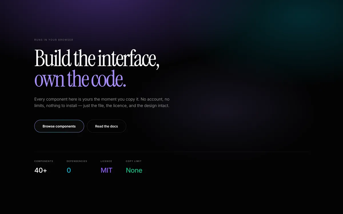
An oversized serif headline over a soft violet wash, with a wide-tracked eyebrow, a shiny-bordered call to action and a toned metric readout along the base.
- Hero
- No dependencies
- MIT
- Instrument Serif · SIL Open Font License 1.1
- Inter · SIL Open Font License 1.1
 Loading
Copy the code
The whole component, in one file. Yours from the moment you paste it.
Install it
Straight into a project with a shadcn setup — no account, no limit.
npx shadcn@latest add https://designblocs.com/r/hero.jsonHand it to an agent
A prompt for Claude Code, Cursor or v0 that adapts the component to your codebase rather than pasting it in raw.
src/components/ui-library/blocks/Hero.tsx
/**
 * Hero — an original DesignBlocs composition, in the house (Synapse) language.
 *
 * Not derived from any reference site. The voice is the one the homepage and
 * the typography suite speak: a near-black ground with one soft wash, a small
 * wide-tracked eyebrow, an oversized Instrument Serif headline set tight
 * (-0.05em, 0.9 leading) with one word carrying the accent, Inter 300 body in
 * the muted ramp, a shiny-bordered pill against a ghost button, and a readout
 * row whose values borrow the violet / cyan / emerald tones.
 *
 * SELF-CONTAINED ON PURPOSE. This file imports nothing but React, and every
 * style it needs is either a complete Tailwind class or lives in the scoped
 * block below. Paste it into any React + Tailwind project and it compiles and
 * renders — which is the whole promise, and is why there is no import of a
 * shared token or animation module here.
 *
 * The scoped <style> carries what a utility class cannot express portably: the
 * two typefaces (a host's `h1 { font-family }` would otherwise beat
 * inheritance), the wash, the shiny border, the focus ring and a reduced-motion
 * guard. It is keyed on this block's own data attribute, so it cannot reach
 * anything else on the page and two heroes can coexist.
 *
 * Instrument Serif and Inter are both OFL-1.1. A project that has not loaded
 * them falls back to a system stack rather than breaking.
 */

export interface HeroCta {
  label: string;
  href: string;
}

export interface HeroReadout {
  label: string;
  value: string;
  /** Which of the house tones the value takes. Defaults to plain white. */
  tone?: "plain" | "violet" | "cyan" | "emerald";
}

export interface HeroProps {
  /** Small wide-tracked label above the headline. */
  eyebrow?: string;
  heading?: string;
  /** Rendered in the accent, inline at the end of the heading. */
  accent?: string;
  lede?: string;
  primaryCta?: HeroCta;
  secondaryCta?: HeroCta;
  /** Metric pairs along the base. Two to four read best; more wrap. */
  readout?: HeroReadout[];
  tone?: "dark" | "light";
  align?: "left" | "centre";
}

const DEFAULTS = {
  eyebrow: "Runs in your browser",
  heading: "Build the interface,",
  accent: "own the code.",
  lede: "Every component here is yours the moment you copy it. No account, no limits, nothing to install — just the file, the licence, and the design intact.",
  primaryCta: { label: "Browse components", href: "#" },
  secondaryCta: { label: "Read the docs", href: "#" },
  readout: [
    { label: "Components", value: "40+", tone: "plain" as const },
    { label: "Dependencies", value: "0", tone: "cyan" as const },
    { label: "Licence", value: "MIT", tone: "violet" as const },
    { label: "Copy limit", value: "None", tone: "emerald" as const },
  ],
  tone: "dark" as const,
  align: "left" as const,
};

/**
 * The block's own styling, scoped to its data attribute.
 *
 * `[data-block="Hero"] h1` outranks a host stylesheet's bare `h1` rule, which
 * is the only reliable way to keep a component's typography when it is dropped
 * into someone else's page.
 */
const STYLES = `
[data-block="Hero"],
[data-block="Hero"] :is(p, a, span, dt, dd) {
  font-family: "Inter Variable", Inter, ui-sans-serif, system-ui, -apple-system, sans-serif;
}
/* The heading face has to name the span too. A rule that targets the span
   directly beats the family it would otherwise inherit from the h1, so an
   accent word set inside the headline silently renders in the body face. */
[data-block="Hero"] h1,
[data-block="Hero"] h1 span {
  font-family: "Instrument Serif", ui-serif, Georgia, "Times New Roman", serif;
  font-weight: 400;
}
[data-block="Hero"] {
  --hero-bg: #030303;
  --hero-fg: #ffffff;
  --hero-body: #a3a3a3;
  --hero-muted: #737373;
  --hero-line: rgba(255, 255, 255, 0.08);
  --hero-line-strong: rgba(255, 255, 255, 0.14);
  --hero-pill: #0a0a0a;
  --hero-pill-hover: #111111;
  --hero-violet: #8b5cf6;
  --hero-violet-soft: #a78bfa;
  --hero-cyan: #06b6d4;
  --hero-cyan-soft: #22d3ee;
  --hero-emerald: #10b981;
  --hero-ease: cubic-bezier(0.23, 1, 0.32, 1);
}
[data-block="Hero"][data-tone="light"] {
  --hero-bg: #f5f5f3;
  --hero-fg: #0a0a0a;
  --hero-body: #525252;
  --hero-muted: #737373;
  --hero-line: rgba(0, 0, 0, 0.1);
  --hero-line-strong: rgba(0, 0, 0, 0.16);
  --hero-pill: #0a0a0a;
  --hero-pill-hover: #1a1a1a;
}
/* One soft wash behind the headline, then a vignette that settles it back into
   the ground. Drawn in CSS so the block carries no image and stays one file. */
[data-block="Hero"]::before {
  content: "";
  position: absolute;
  inset: 0;
  background:
    radial-gradient(70% 60% at 30% -5%, rgba(139, 92, 246, 0.38) 0%, transparent 68%),
    radial-gradient(55% 50% at 88% 8%, rgba(6, 182, 212, 0.22) 0%, transparent 70%),
    radial-gradient(40% 40% at 65% 55%, rgba(167, 139, 250, 0.12) 0%, transparent 70%);
  pointer-events: none;
}
[data-block="Hero"]::after {
  content: "";
  position: absolute;
  inset: 0;
  background: linear-gradient(to bottom, transparent 0%, transparent 55%, var(--hero-bg) 100%);
  pointer-events: none;
}
/* The shiny pill: a gradient hairline behind an inset solid pill. */
[data-block="Hero"] .hero-shiny {
  position: relative;
  display: inline-block;
  padding: 1px;
  border-radius: 9999px;
  overflow: hidden;
  isolation: isolate;
  background: linear-gradient(120deg, var(--hero-violet-soft), var(--hero-cyan-soft), var(--hero-violet-soft));
  text-decoration: none;
}
[data-block="Hero"] .hero-shiny > span {
  position: relative;
  z-index: 1;
  display: block;
  border-radius: 9999px;
  background: var(--hero-pill);
  padding: 15px 34px;
  font-size: 14px;
  font-weight: 600;
  color: #fff;
  transition: background 0.3s var(--hero-ease);
}
[data-block="Hero"] .hero-shiny:hover > span { background: var(--hero-pill-hover); }
[data-block="Hero"] .hero-ghost {
  display: inline-block;
  border: 1px solid var(--hero-line-strong);
  border-radius: 9999px;
  padding: 16px 34px;
  font-size: 14px;
  font-weight: 500;
  color: var(--hero-fg);
  text-decoration: none;
  transition: border-color 0.3s var(--hero-ease), background 0.3s var(--hero-ease);
}
[data-block="Hero"] .hero-ghost:hover {
  border-color: var(--hero-fg);
}
[data-block="Hero"] .hero-rise {
  animation: hero-rise 0.8s var(--hero-ease) both;
}
@keyframes hero-rise {
  from { opacity: 0; transform: translateY(20px); }
  to { opacity: 1; transform: none; }
}
[data-block="Hero"] a:focus-visible {
  outline: 2px solid var(--hero-cyan-soft);
  outline-offset: 3px;
}
@media (prefers-reduced-motion: reduce) {
  [data-block="Hero"] .hero-rise { animation: none; }
}
`;

const TONE_VAR: Record<string, string> = {
  plain: "var(--hero-fg)",
  violet: "var(--hero-violet)",
  cyan: "var(--hero-cyan)",
  emerald: "var(--hero-emerald)",
};

export function Hero(props: HeroProps) {
  const p = { ...DEFAULTS, ...props };
  const centred = p.align === "centre";

  return (
    <section
      data-block="Hero"
      data-tone={p.tone}
      className="relative isolate overflow-hidden"
      style={{ background: "var(--hero-bg)", color: "var(--hero-body)" }}
    >
      <style dangerouslySetInnerHTML={{ __html: STYLES }} />

      <div
        className={`relative z-10 mx-auto max-w-[1200px] px-6 pb-20 pt-28 sm:pb-28 sm:pt-40 ${
          centred ? "text-center" : ""
        }`}
      >
        <div className={centred ? "mx-auto max-w-3xl" : "max-w-3xl"}>
          {p.eyebrow && (
            <p
              className="hero-rise mb-7 text-[10px] font-normal uppercase tracking-[0.2em]"
              style={{ color: "var(--hero-muted)" }}
            >
              {p.eyebrow}
            </p>
          )}

          <h1
            className="hero-rise text-balance text-[clamp(3rem,8vw,6rem)] leading-[0.9] tracking-[-0.05em]"
            style={{ color: "var(--hero-fg)", animationDelay: "0.1s" }}
          >
            {p.heading}
            {p.accent && <> <span style={{ color: "var(--hero-violet-soft)" }}>{p.accent}</span></>}
          </h1>

          {p.lede && (
            <p
              className={`hero-rise mt-7 max-w-xl text-[1.0625rem] font-light leading-relaxed ${
                centred ? "mx-auto" : ""
              }`}
              style={{ color: "var(--hero-body)", animationDelay: "0.2s" }}
            >
              {p.lede}
            </p>
          )}

          {(p.primaryCta || p.secondaryCta) && (
            <div
              className={`hero-rise mt-11 flex flex-wrap items-center gap-3 ${centred ? "justify-center" : ""}`}
              style={{ animationDelay: "0.3s" }}
            >
              {p.primaryCta && (
                <a href={p.primaryCta.href} className="hero-shiny" data-cta="primary">
                  <span>{p.primaryCta.label}</span>
                </a>
              )}
              {p.secondaryCta && (
                <a href={p.secondaryCta.href} className="hero-ghost" data-cta="secondary">
                  {p.secondaryCta.label}
                </a>
              )}
            </div>
          )}
        </div>

        {p.readout && p.readout.length > 0 && (
          <dl
            className={`hero-rise mt-20 flex flex-wrap gap-x-14 gap-y-8 border-t pt-8 ${
              centred ? "justify-center" : ""
            }`}
            style={{ borderColor: "var(--hero-line)", animationDelay: "0.4s" }}
          >
            {p.readout.map((item) => (
              <div key={item.label}>
                <dt
                  className="text-[9px] font-semibold uppercase tracking-[0.16em]"
                  style={{ color: "var(--hero-muted)" }}
                >
                  {item.label}
                </dt>
                <dd
                  className="mt-2.5 text-[1.75rem] font-medium tracking-[-0.02em]"
                  style={{ color: TONE_VAR[item.tone ?? "plain"] }}
                >
                  {item.value}
                </dd>
              </div>
            ))}
          </dl>
        )}
      </div>
    </section>
  );
}

/* A named export as well as the default, so a project that takes this file can
   import it either way. */
export default Hero;